Have you ever wondered what color you get when you mix red and blue? Whether you’re a budding artist, a designer, or simply curious about colors, understanding how primary colors interact can be both fun and useful.
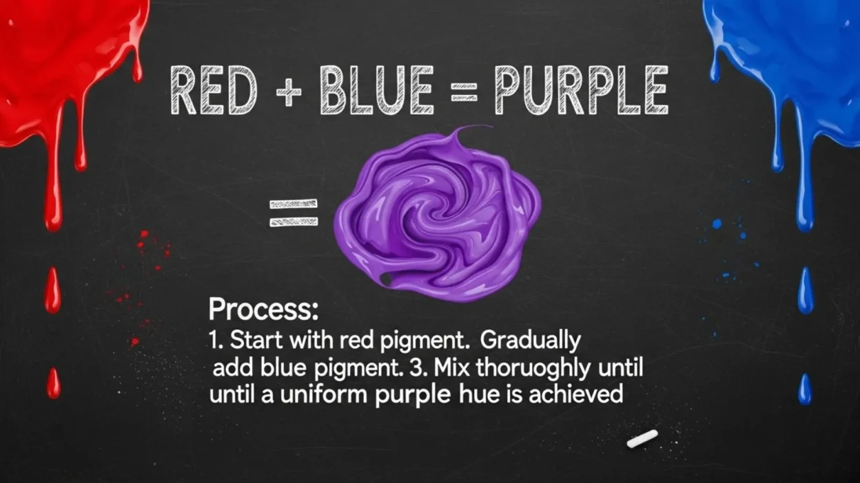
Red and blue are two of the three primary colors, meaning they cannot be created by mixing other colors. When combined, they form a secondary color that has captured the imagination of artists, designers, and even scientists for centuries: purple.
But the story doesn’t end there. The exact shade you get can vary depending on the type of red and blue you use, whether you’re mixing paints, inks, or digital colors.
In this guide, we’ll explore the science behind mixing red and blue, the different shades you can create, and practical tips for using this vibrant combination in art, design, and everyday life.
What Are Primary Colors?
Before diving into what happens when red and blue mix, it’s important to understand primary colors. Primary colors are the foundation of all other colors. In traditional art and painting, the three primary colors are red, blue, and yellow. These colors are unique because they cannot be created by mixing other colors together. Instead, they serve as the building blocks for all secondary and tertiary colors.
For example, when you mix two primary colors, you get a secondary color. Mixing red and blue gives purple, blue and yellow create green, and red and yellow produce orange. Understanding this basic concept is essential for artists, designers, and anyone experimenting with colors at home.
Primary colors are not just limited to paint. In digital design, primary colors work differently through light-based mixing. In the RGB (Red, Green, Blue) color system used for screens, these colors combine to create different colors of light. Meanwhile, in print and painting (subtractive mixing), the physical pigments blend to produce new shades.
Knowing what primary colors are and how they interact helps you predict the results when mixing colors. Whether you’re working on a painting, a digital project, or even choosing color palettes for your home, this foundation makes it easier to create the exact shade you want.
The Science of Mixing Red and Blue
Mixing colors may seem simple, but there’s actual science behind why red and blue make purple. It all comes down to the way colors interact, which depends on whether you’re mixing light or pigments.
In subtractive color mixing—like with paints, inks, or dyes—colors work by absorbing (subtracting) certain wavelengths of light and reflecting others. Red paint reflects red light, and blue paint reflects blue light. When you mix red and blue pigments, each color absorbs some wavelengths and reflects a combination that our eyes perceive as purple. The exact shade of purple can vary depending on the type of red and blue used. For instance, mixing crimson with navy gives a deeper, more muted purple, while bright red and sky blue create a vivid, almost electric purple.
In contrast, additive color mixing, which occurs with light (like on computer screens), works differently. Red and blue light combine to form magenta, a bright pinkish-purple color. This is why digital art often looks slightly different from painted art—the medium changes the final color.
Understanding this distinction is crucial for artists, designers, and anyone experimenting with color. It helps you predict results and adjust your mixtures for the exact shade you want. Whether you’re mixing paints on a canvas or adjusting colors in a digital program, the science behind red and blue gives you the tools to create stunning purples.
Shades and Variations of Purple
When you mix red and blue, the resulting color is generally purple, but the exact shade can vary widely depending on the ratio and type of colors used. By adjusting the amounts of red or blue, you can create a spectrum of purples ranging from soft and pastel to deep and dramatic.
For example, more red than blue produces a warmer purple, often called magenta or reddish-purple, while more blue than red results in a cooler, bluish-purple, such as violet or indigo. Even subtle differences in the specific shades of red and blue used—like crimson versus scarlet, or navy versus sky blue—can dramatically change the outcome.
Artists and designers often exploit these variations to convey mood and emotion. Lavender, a light purple, evokes calmness and elegance, while plum, a darker shade, communicates richness and sophistication. Vivid purples can add energy and vibrancy to artwork or design projects.
Understanding these variations is not only helpful for painting but also in digital design, fashion, and home décor. By experimenting with different ratios and materials, you can find the perfect purple for your project. Whether you’re mixing paints for a canvas or combining colors digitally, knowing how to manipulate red and blue lets you create a wide array of beautiful purples.
Red and Blue in Digital Media
Mixing red and blue isn’t limited to paints or pigments—digital media has its own rules for color mixing. On screens, computers, and TVs, colors are created using light-based additive mixing, which works differently from mixing physical paints. The RGB color system—short for Red, Green, and Blue—is the foundation of all digital colors.
In additive mixing, each color is represented by light values. Red light combined with blue light produces magenta, a bright, pinkish-purple that is slightly different from the purple you might get with paints. By adjusting the intensity of red and blue light, designers can create millions of shades of purple, from subtle pastels to vivid, neon-like colors.
This principle is essential for graphic designers, web developers, and digital artists. For example, using hex codes or RGB values, a designer can precisely control the shade of purple to match branding or design needs. Unlike paint, where results can vary based on pigment quality, digital mixing ensures consistency across devices.
Understanding the difference between subtractive (paint) and additive (light) mixing helps bridge traditional and digital art. It allows artists to anticipate how colors will appear both on canvas and on screens. By mastering digital color mixing, you can replicate real-life shades or experiment with bold new purples that are impossible with paint alone.
Psychological and Cultural Significance of Purple
Purple, the color created by mixing red and blue, carries a rich history and powerful psychological associations. Across cultures, it has long been connected to royalty, luxury, and wealth, primarily because purple dye was historically rare and expensive. In ancient times, only emperors, kings, and high-ranking officials could afford garments dyed in true purple, making it a symbol of power and prestige.
Beyond its cultural significance, purple also has psychological effects. Lighter shades, like lavender, are often associated with calmness, relaxation, and serenity, making them popular in bedrooms, spas, and wellness spaces. Darker purples, such as plum or deep violet, evoke mystery, creativity, and sophistication, which is why designers frequently use these shades in fashion, branding, and artwork.
Purple’s unique combination of red’s energy and blue’s calm creates a balance that stimulates both creativity and introspection. Artists and psychologists alike note that using purple can inspire imagination while also conveying elegance and depth.
In modern design and marketing, purple is widely used to stand out and create memorable impressions. From luxury brands to creative industries, purple signals originality, quality, and imagination. Understanding the cultural and psychological significance of purple helps artists, designers, and even homeowners choose the right shade to communicate the desired mood or message effectively.
Common Mistakes and Tips When Mixing Colors
Mixing red and blue may seem simple, but beginners often encounter mistakes that can affect the final result. One common issue is overmixing, which can lead to a muddy or dull purple instead of a vibrant shade. This usually happens when too much paint is blended or when the colors are not clean, resulting in unwanted grayish tones.
Another frequent mistake is using incompatible shades of red and blue. For example, mixing a very dark blue with a bright red may produce a muted purple, while using complementary hues can create an unexpected tone. Testing small amounts of paint before committing to a full project helps avoid these surprises.
Beginners also sometimes forget to consider the medium. Mixing pigments in paint behaves differently than mixing colored pencils, inks, or digital colors. In digital design, using incorrect RGB or hex values can lead to inconsistent results on different screens.
Here are some practical tips for successful color mixing:
- Start small: Test combinations on a palette or scrap paper.
- Adjust gradually: Add a little more red or blue at a time to reach the desired shade.
- Keep colors clean: Avoid mixing colors that are already muddy or contaminated.
- Use ratios: Remember that more red creates a warmer purple, more blue produces a cooler one.
- Experiment: Practice mixing different shades to understand how each combination reacts.
Practical Experiments and DIY Projects
Mixing red and blue can be a fun and educational experience, especially through hands-on experiments. Whether you’re a beginner, a student, or a hobbyist, trying out practical projects helps you understand color theory and create beautiful purples.
One simple experiment is using watercolor or acrylic paints. Start with small amounts of red and blue on a palette. Gradually mix them to observe how different ratios produce various shades, from soft lavender to deep plum. This exercise helps you see the effect of subtle changes in color proportions.
For a more interactive project, try mixing colored lights. Using red and blue LED lights, shine them onto a white surface. You’ll notice that when the lights overlap, they create magenta, demonstrating additive color mixing in real time. This is especially useful for students learning how light behaves differently from paint.
Another creative DIY is to make purple-themed crafts, like tie-dye fabrics, colored slime, or custom greeting cards. By experimenting with red and blue in different materials, you can see how texture and medium affect the final shade.
These hands-on projects are not just for fun—they also teach important lessons about color mixing, ratios, and the impact of different materials. By experimenting, you gain a better sense of how red and blue interact, helping you apply these skills in painting, design, digital art, or even home décor.
Real Life Applications of Red + Blue = Purple
Purple, created by mixing red and blue, isn’t just a color for art—it has many practical applications in everyday life. Designers, artists, and marketers use purple to communicate creativity, luxury, and sophistication, making it a versatile and powerful color choice.
In interior design, purple can transform a room’s mood. Light purples, like lavender, are calming and perfect for bedrooms or relaxation spaces, while darker shades, such as plum or eggplant, add a sense of richness and elegance to living rooms or offices. Accents like cushions, curtains, or wall paint can make a space feel luxurious without overwhelming it.
In fashion, purple is a favorite for both bold statements and subtle elegance. From evening gowns to casual accessories, designers use different purple shades to evoke emotion and style. Lighter purples feel soft and feminine, while deeper purples convey confidence and sophistication.
Branding and marketing also heavily rely on purple. Many companies use it to stand out and suggest creativity, quality, or innovation. Well-known brands choose purple in logos or packaging to make a lasting impression on consumers.
Even in art and crafts, purple is a staple for creating contrast, highlighting features, or evoking emotion. Understanding how to mix red and blue to achieve the right purple shade allows artists, designers, and creators to use this color effectively in multiple contexts.
Whether in design, fashion, branding, or art, purple proves that mixing red and blue can produce a color with endless possibilities.
Fun Facts About Purple
Purple, the vibrant result of mixing red and blue, has fascinated people for centuries and carries many interesting facts. Historically, purple was considered the color of royalty and power. In ancient times, creating purple dye was extremely labor-intensive and expensive, made from tiny sea snails. Only kings, queens, and wealthy elites could afford garments dyed in true purple, which is why it became a symbol of luxury and prestige.
In nature, purple is less common than other colors, making it stand out wherever it appears. Examples include lavender flowers, grapes, eggplants, and certain butterflies. Its rarity in nature adds to its unique and eye-catching appeal.
Purple also has fascinating psychological effects. It is associated with creativity, imagination, and mystery, making it a favorite among artists, writers, and designers. Lighter shades like lavender can promote calmness and relaxation, while darker shades such as plum or deep violet evoke luxury, sophistication, and depth.
In the modern world, purple is widely used in branding and marketing to convey originality and quality. It’s also popular in fashion, home décor, and digital design. Purple-themed products are often chosen to make a bold statement or to stand out from the crowd.
These fun facts show that purple is not just a color—it carries history, symbolism, and psychological impact. By understanding its origins and effects, you can appreciate why mixing red and blue to create purple continues to captivate artists, designers, and color enthusiasts around the world.
Frequently Asked Questions (FAQs)
1. What color do you get if you add more red than blue?
Adding more red to your mix produces a warmer, reddish-purple, often called magenta. The shade appears vibrant and slightly pinkish compared to a balanced purple mix.
2. What color do you get if you add more blue than red?
Adding extra blue results in a cooler, bluish-purple, like violet or indigo. This shade is deeper and often feels more calming or mysterious.
3. Can red and blue make pink?
No, pink is made by mixing red with white, not blue. Mixing red and blue always produces a form of purple, though the exact tone depends on the ratio and type of red and blue used.
4. What happens if you mix red, blue, and yellow?
Combining all three primary colors typically produces a brown or grayish tone, depending on the shades. This happens because all colors absorb different wavelengths, canceling out brightness.
5. Why does purple look different on screens versus paint?
This is due to additive versus subtractive color mixing. On screens (RGB), red + blue light creates magenta, while in paint (subtractive mixing), red + blue pigments produce purple. The medium affects how the color is perceived.
6. How can I create different shades of purple?
Experiment with ratios and shades of red and blue. More red yields warmer purples, more blue yields cooler purples, and adding small amounts of white or black can lighten or darken the shade.
Conclusion:
Mixing red and blue is one of the most fundamental concepts in color theory, yet it opens up a world of possibilities. When combined, these two primary colors create purple, a versatile secondary color with countless shades from soft lavender to deep plum.
The exact tone depends on the ratio of red to blue, the specific shades used, and the medium, whether it’s paint, ink, or digital screens.
Beyond its visual appeal, purple carries cultural, psychological, and practical significance. Historically linked to royalty and luxury, it now symbolizes creativity, sophistication, and imagination in art, design, fashion, and branding.
Understanding the science of color mixing, common mistakes, and practical applications empowers artists, designers, and enthusiasts to experiment confidently.
So next time you pick up your paints or work on a digital project, remember: red and blue together can create an endless spectrum of beautiful purples. Experiment, explore, and enjoy the vibrant possibilities this powerful combination offers.